A new and local soup business that is dear to my heart!
(My love good people and great food)
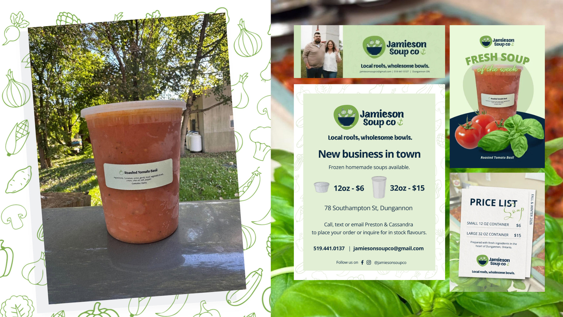
This wonderful couple was looking for something that spoke to them personally. Preston being from the East coast and the chef of the business wanted to pay homage to his home base of Nova Scotia. So we worked in little details that felt just right. The little anchor represent stability, East Coast vibes and their love for all things water
(specifically the fish ;). This logo is all about fun and community. Bringing in simple veggie shapes, the unique off-circle background and the playful-but-bold font helps bring a humanizing feel to the brand.
(My love good people and great food)
This wonderful couple was looking for something that spoke to them personally. Preston being from the East coast and the chef of the business wanted to pay homage to his home base of Nova Scotia. So we worked in little details that felt just right. The little anchor represent stability, East Coast vibes and their love for all things water
(specifically the fish ;). This logo is all about fun and community. Bringing in simple veggie shapes, the unique off-circle background and the playful-but-bold font helps bring a humanizing feel to the brand.
We started with the core brand and then went on to support items like custom branding for the soup packages, socials covers, animated social video, static social posts, posters, lawn signs and so much more. Seeing a brand come to life in actuality is a beautiful thing!
Overall I truly loved creating this brand and they have already heard wonderful feedback from new clients and their community. Thanks for the trust Preston & Cassandra!
Check out their socials to get your hands on their delicious product:
Check out their socials to get your hands on their delicious product: